Blog Post
I Swarm, You Swarm, We All Swarm for Beeswarm (Plots)
November 21, 2014
In a recent Blog Post, we introduced you to Rho’s Center for Applied Data Visualization (ADV).
One of the ADV’s goals is to share some of our data visualization tools open source online. The first tools we are releasing are a set of statistical programming packages that will create “beeswarm plots.” We are providing 3 examples using a SAS macro and 2 R code examples that the ADV developed.
What is a beeswarm plot?
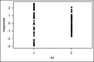
Imagine that you have a continuous data variable that you want to compare between two different treatment groups (e.g., change in blood glucose levels for group 1 vs. group 2). One way to plot these data would be to create a strip plot, like this:

As you can see, one potential problem with a strip plot is that you could have very dense grouping of data points, leading to data points being plotted over top of one another on the chart and obscuring the data.
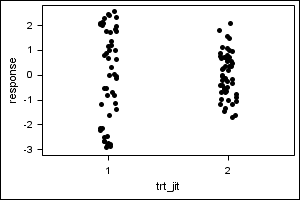
One technique to avoid this overplotting is to apply a random jittering effect, which uses an algorithm to randomly move the data points away from one another a little so you can better see the data, like so:

This is better, but it’s still not a great display. The random jitter effect does not guarantee that overplotting will be avoided, and it often results in some points being moved unnecessarily.
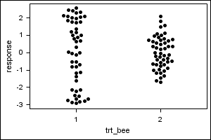
A beeswarm plot improves upon the random jittering approach to move data points the minimum distance away from one another to avoid overlays.
The result is a plot where you can see each distinct data point, like so:

It looks a bit like a friendly swarm of bees buzzing about their hive. More importantly, each data point is clearly visible and no data are obscured by overplotting.
It looks a bit like a friendly swarm of bees buzzing about their hive. More importantly, each data point is clearly visible and no data are obscured by overplotting.
Check out the plots and code, and other technical details at our public new graphics sharing website: graphics.rhoworld.com.
If you would like to learn more about Rho’s data visualization work, we would love to hear from you at: graphics@rhoworld.com.
Otherwise, stay tuned for more graphics releases to come.
