Blog Post
Adaptive Design Series: Pruning Designs 101
September 18, 2012
Note: This article is one of a series about adaptive design that come from a blog written by Dr. Karen Kesler from 2010 to 2011. That blog is no longer active, but it contained some great information, so we wanted to re-post it here.
Pruning designs are a variation of group sequential studies but without the strict Type I error control. They are ideal for Phase II dose finding when you have a large number of doses or regimens (>3) to investigate. The general idea is that you start with a range of active dose/regimen arms and one placebo (or control) arm, run several interim analyses and “prune” the less effective doses at each interim, leaving the most promising one or two active arms (and placebo) for the final analysis. Pruning is accomplished by not randomizing any more subjects to the pruned arm.
Why would we want to use this crazy design? Compared to a traditional Phase II study with no interims and a smaller number of doses, say 2 or 3, we get information on a wider range of doses and we don’t expose as many subjects to less effective doses. It also provides a hedge against choosing the wrong place on the dose response curve by covering a larger area.
The key to these designs are the futility boundaries. The efficacy bounds are important too, but since we’re in early stages, we’re probably not including enough subjects to be powered to see typical efficacy differences. We’re also going to want to look at enough subjects to get information on big safety issues, so stopping early for efficacy is not really the main goal. Futility, however, is the main goal. In order for this design to be truly effective, you need to prune dose arms early and often.
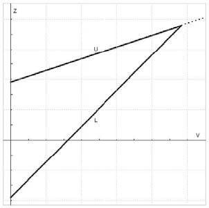
To build the boundaries, I usually start with Whitehead triangular boundaries for the comparison of two groups. Like these:

The x-axis is information, the y-axis is the test statistic, the upper boundary (U) is for efficacy and the lower boundary (L) is for futility. At each interim, you calculate the test statistics comparing each active arm to the placebo arm, and plot the information vs. the test statistic. If your point is below the futility boundary, it’s futile and you prune it. If your point is above the efficacy boundary, you stop for efficacy, and if it’s between the two boundaries, you keep going. That’s the basic premise, but of course, the devil is in the details. For example, these Whitehead boundaries are for continual reassessment (i.e. after each subject achieves the outcome of interest) and we’re certainly not interested in doing that. Also, the amount of information at a specific interim could be different for the arms, which leads to a scatter across the x-axis. But the biggest problem is that the futility bound is usually not in the right place to prune arms as often as we want it to.
In order to balance the risks and benefits of pruning, allowing the best doses continue, we need to adjust the Whitehead boundaries. I have to admit, it surprised me that the Whitehead bounds provide such a great starting point. I figured we’d have to adjust the heck out of them, but usually a little bit of tweaking does the trick. (We’ve done some investigation into the optimal shape, but I’ll save that for another post.) For now, we’ll just adjust the intercepts of the two bounds and basically move them up or down. The real question is what are we optimizing these boundaries to? You may have noticed that we’ve moved pretty far afield from the Neymann-Pearson hypothesis testing framework we usual live and play in.
There are a few options here, but my long-time mentor, Ron Helms, came up with some intuitive and practical metrics, and we’ve found them to work pretty darn well. The concept is to think about what you want to happen with your study under different scenarios and use those as your metrics. Specifically, if none of the doses are efficacious (null case) you want to prune a lot of arms very early and by the end come to the conclusion that none of the doses are efficacious, so your metric is how often do you not choose a dose in this case. On the other hand, if some doses work, you want to pick the one that works the best, so your metric in this case is the percentage of time you pick the “best” dose (according to your assumed efficacy levels) as the “winner” (it either crosses the efficacy boundary or has the best efficacy at the end). The last metric we use tries to maximize the pruning—without this one, we wouldn’t prune arms and we’d lose the efficiency that we want. This one is trickier to define, but we usually measure how often we have 2 active arms after the last interim analysis. We can also use total sample size or how often ineffective doses are pruned at each interim. Then you run simulated studies and adjust the boundaries up or down (they can move independently of each other) until you hit the balance of pruning vs. picking the right dose. Another great feature of these metrics is that non-statisticians understand them, so it’s easy to get the rest of your research team to help pick the boundaries. (And if you’ve ever tried to explain the statistical version of power to non-statisticians, you’ll appreciate this aspect.)
I’d love to hear other people’s ideas for metrics—I’m not convinced we’ve hit on the perfect combination yet. (And it’s okay to take me to task over the lack of statistical rigor—it’s always good to discuss that.)
