Blog Post
An Interactive Suite of Data Visualizations for Safety Monitoring
February 23, 2017
This is the fourth in a series of posts introducing open source tools Rho is developing and sharing online. Click here to learn more about Rho’s open source effort, here to read about our interactive data visualization library, Webcharts, and here to learn about SAS graphing tools we’ve developed.
Frequent and careful monitoring of patient safety is one of the most important concerns of any clinical trial. For the medical monitors and safety monitoring committees responsible for supervising patient well-being and ensuring product safety, this obligation requires continuous access to a variety of critical study data.
For trials with large participant enrollment, severe diseases, or complex treatments, study monitors may be tasked with reviewing thousands of data points and safety markers. Unfortunately, traditional reporting methods require monitors to comb through scores of static listings and summary tables. This method is inefficient and poses the risk that clinically-relevant signals will be obscured by the sheer volume of data common in clinical trials.
To improve safety monitoring, we created a suite of interactive data monitoring tools we call the Safety Explorer. Although the safety explorer can be configured to include a variety of charts specific to each study, the standard set-up includes 6 charts (click the links to learn more):
- Adverse Events Explorer – dynamically query adverse event (AE) data in real time to go from study population view to individual patient records
- Adverse Events Timeline – view interactive timelines for each participant showing when AEs occurred in a trial
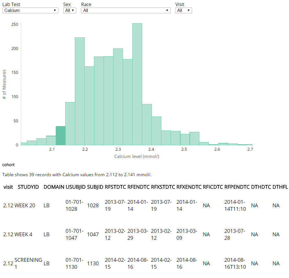
- Test Results Histogram– explore interactive histograms showing distribution of labs, vital signs, and other safety measures with linked data tables
- Test Results Outlier Explorer – track patient trajectories over time for lab measures, vital signs, and other safety endpoints in line charts
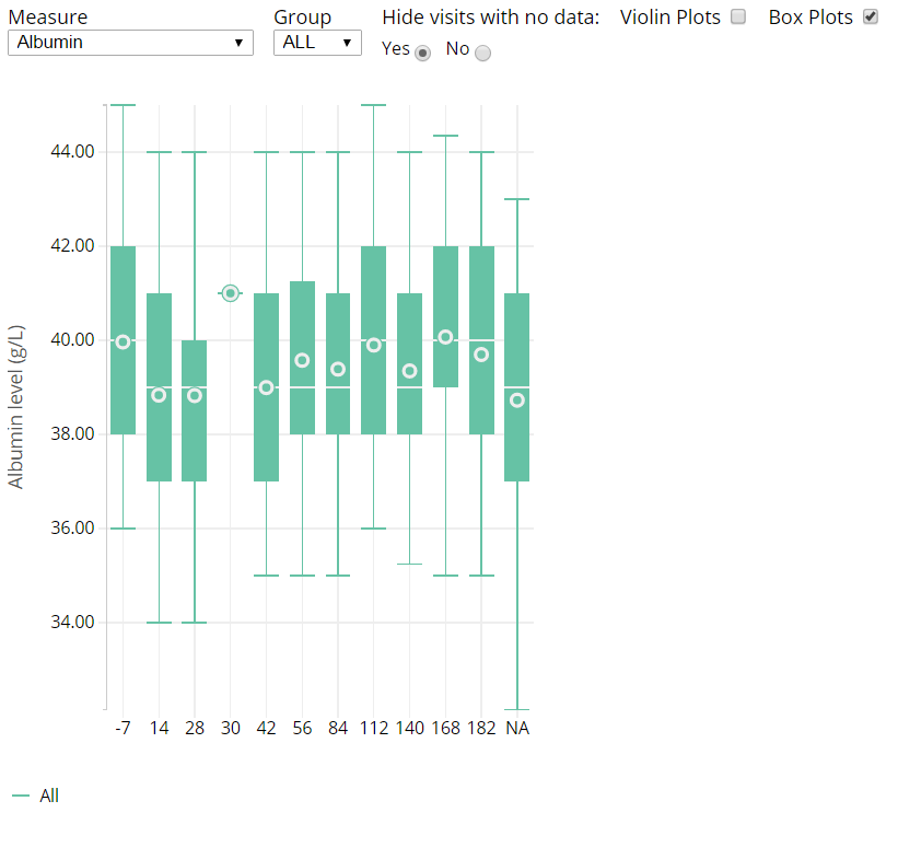
- Test Results Over Time – explore population averages for labs, vital signs, and other safety endpoints in box or violin plots
- Shift Plot – monitor changes in lab measures, vital signs, and other safety endpoints between study events in a dot plot
The safety explorer utilizes common CDISC data standards to quickly create consistent charts for any project. Within a given chart, users can use filters to dynamically sort, highlight, and drill down to data points of interest using controls familiar to anyone who has used a website.
Interactive Histogram with Linked Table

Explore the distribution of test results.
Graphical representations of data grant reviewers a systematic snapshot of the data that helps tell the story of the information. By adding interactive elements, reviewers can quickly examine the charts for patterns of interest and drill down to subject-level data instantly. This ability to quickly distinguish signal from noise, gives monitors greater insight into their data and allows them to work much more efficiently.
It is common practice for us to create safety explorers for all full service projects and studies where Rho provides medical monitoring. All of the charts described here are open source and free to use, so please let us know if you have any feedback, or would like to contribute!
Interactive Box Plot Showing Results Over Time

Track changes in population test results through a study.
 Ryan Bailey, MA is a Senior Clinical Researcher at Rho. He has over 10 years of experience conducting multicenter asthma research studies, including the Inner City Asthma Consortium (ICAC) and the Community Healthcare for Asthma Management and Prevention of Symptoms (CHAMPS) project. Ryan also coordinates Rho’s Center for Applied Data Visualization, which develops novel data visualizations and statistical graphics for use in clinical trials.
