Blog Post
Data Visualization: Find your Flow with Sankey Bar Charts
June 2, 2015
Many clinical trials collect prospective categorical data from participants to chart changes in the study population over time. Common examples would be quality of life questionnaires or risk scales, which provide a quick, standardized assessment of participant outcomes at a given time point.
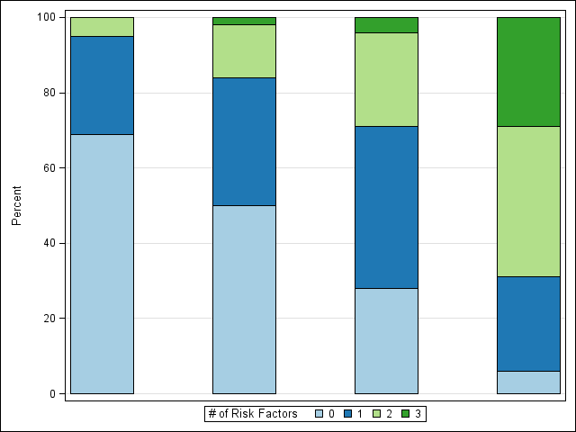
A popular method for reporting prospective categorical data is to show results in a stacked bar chart. Consider the stacked bar chart below which reports number of risk factors participants exhibited at each of a series of visits.

This stacked bar chart is useful for quickly identifying trends in the overall study population – in this case, we can observe an increase in risk factors reported over time – but it does not provide much information about subgroups in the study. In the era of personalized and precision medicine, subgroup analysis is increasingly important for identifying which groups of people are most likely (or least likely) to respond to a particular treatment.
In our example above, we can see that there is a sizable increase in participants reporting 3 risk factors (dark green bar) from the 30-month visit to the 60-month visit. Where did these high-risk factor participants come from? We might assume they came from the group who had previously reported 2 or more risk factors, but the bar graph alone does not answer this question.
One solution is to overlay a Sankey flow diagram to the chart to shed some light on this mystery. Sankey diagrams were popularized by Matthew Henry Phineas Riall Sankey, a 19th-century Irish engineer, who created flow diagrams where the size of the arrow between two nodes is proportional to the magnitude of the flow.
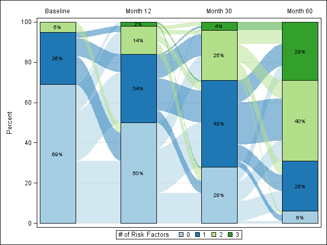
With a Sankey Bar Chart, we can get the following visualization of our data:

Now we can see how our data flow between each time point, which helps us identify patterns in our data.
Let’s revisit our question from earlier. Where did the 29% of high-risk factor participants at 60 months come from? According to the diagram, some came from the groups reporting 2 and 3 risk factors at 12-months, but more than half came from the groups previously reporting 0 or 1 risk factor – not what we might have expected from just looking at the bar chart.
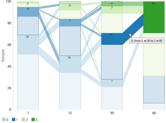
For those wanting to really dive into their data, we can provide an interactive version allowing users to explore the chart by selecting individual bar sections or flows and isolating the data for those sections.

Like all good data visualizations, the Sankey bar chart is designed to communicate the story behind the data. The bar chart alone tells part of the story, but adding a Sankey overlay provides a richer and more detailed understanding of our data.
Rho’s Center for Applied Data Visualization (ADV) specializes in bringing clinical data to life by making charts like these for use in both static and interactive formats. You can visit Rho’s Graphics-sharing website to learn more about the Sankey Bar Chart, play with an interactive version of the tool, read a paper on creating Sankey bar charts in SAS (presented by ADV member Shane Rosanbalm at the 2015 PharmaSUG conference), and see some of the other data visualizations the ADV have developed.
If you’d like more information about how Rho can create visualizations for your research project, contact us.
