Kristen Mason, MS, is a Senior Biostatistician at Rho. She has over 4 years of experience providing statistical support for studies conducted under the Immune Tolerance Network (ITN) and Clinical Trials in Organ Transplantation (CTOT). She has a particular interest in data visualization, especially creating visualizations within SAS using the graph template language (GTL).
Heather Kopetskie, MS, is a Senior Biostatistician at Rho. She has over 10 years of experience in statistical planning, analysis, and reporting for Phase 1, 2 and 3 clinical trials and observational studies. Her research experience includes over 8 years focusing on solid organ and cell transplantation through work on the Immune Tolerance Network (ITN) and Clinical Trials in Organ Transplantation (CTOT) project. In addition, Heather serves as Rho’s biostatistics operational service leader, an internal expert sharing biostatistical industry trends, best practices, processes and training.
Preparing a database for lock can be a burdensome process. It requires coordinated effort from an entire clinical study team, including, but not limited to, the clinical data manager, study monitor, biostatistician, clinical project manager, principal investigator, and medical monitor. The team must work together to ensure the accuracy and reliability of the data, but with so many sites, subjects, visits, case report forms (CRFs), and data points it can be difficult to stay on top of the entire process.
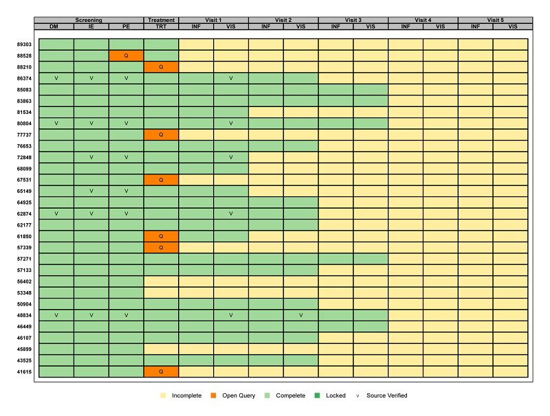
Using existing metadata (see Mining Metadata for Clinical Research Activities for more information on metadata) graphics can be created to visually represent the overall status of each requirement for database lock. This is possible using a graphic called a ‘heat map’ that displays the CRF metadata. The resulting graphic is shown below.

The graphic has one row per subject and one column for each CRF collected at each visit. This results in one ‘box’ per subject per visit per CRF. Each box is colored and/or annotated to indicate the current status of each CRF.
Broadly speaking, a quick glance at this graphic can show the clinical study team exactly how many CRFs have yet to be completed, where queries have not yet been closed, which CRFs have been source data verified, and whether or not an individual CRF has been locked. Not to mention, all of this information can be identified for a specific subject at a specific visit for a specific CRF.
Focusing on the details of our particular example, it is easy to see that no subject has yet initiated data entry for both Visit 4 and Visit 5. Additionally, three subjects have not started data entry for the Treatment Visit, ten for Visit 1, fifteen for Visit 2, and twenty-four for Visit 3. An open query remains for several subjects on the TRT form at the Treatment Visit, and for just subject 88528 on the PE form at the Screening Visit. A handful of forms have been source verified and no CRFs have been locked. Additionally, the graphic provides detail on the total number of subjects, visits, and CRFs for the study. This helps reveal specifics such as which visits are more burdensome with multiple CRFs and exactly how far along the subjects are in the study.
Historically, this information has been conveyed through pages and pages of multiple listings, which can take minutes if not hours to decipher. Having all of the information in a single snapshot can help determine what steps need to be taken to get to database lock quickly and accurately.
Further instruction on how to implement this graphic within SAS will be available soon.
